Flex布局教程-实例篇[转]
Created at 2016-09-21
Updated at 2017-01-06
Category
Front-End
Tag
CSS
/
CSS布局
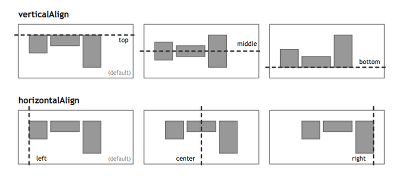
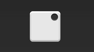
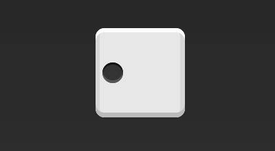
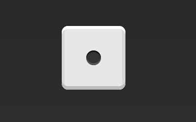
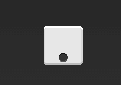
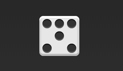
一、骰子的布局
1 2 3
| <div class="box"> <span class="item"></span> </div>
|
- 上面代码中,
div元素(代表骰子的一个面)是Flex容器,span元素(代表一个点)是Flex项目。如果有多个项目,就要添加多个span元素,以此类推
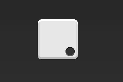
1.1 单项目
- 首先,只有左上角1个点的情况。
Flex布局默认就是首行左对齐,所以一行代码就够了
1 2 3
| .box { display: flex; }
|
1 2 3 4
| .box { display: flex; justify-content: center; }
|
1 2 3 4
| .box { display: flex; justify-content: flex-end; }
|
1 2 3 4
| .box { display: flex; align-items: center; }
|
1 2 3 4 5
| .box { display: flex; justify-content: center; align-items: center; }
|
1 2 3 4 5
| .box { display: flex; justify-content: center; align-items: flex-end; }
|
1 2 3 4 5
| .box { display: flex; justify-content: flex-end; align-items: flex-end; }
|
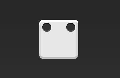
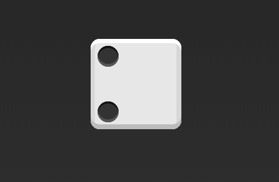
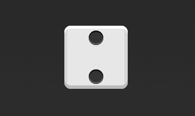
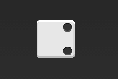
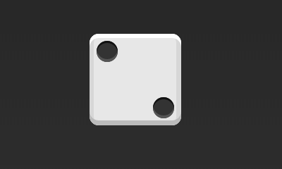
1.2 双项目
1 2 3 4
| .box { display: flex; justify-content: space-between; }
|
1 2 3 4 5
| .box { display: flex; flex-direction: column; justify-content: space-between; }
|
1 2 3 4 5 6
| .box { display: flex; flex-direction: column; justify-content: space-between; align-items: center; }
|
1 2 3 4 5 6
| .box { display: flex; flex-direction: column; justify-content: space-between; align-items: flex-end; }
|
1 2 3 4 5 6 7
| .box { display: flex; } .item:nth-child(2) { align-self: center; }
|
1 2 3 4 5 6 7 8
| .box { display: flex; justify-content: space-between; } .item:nth-child(2) { align-self: flex-end; }
|
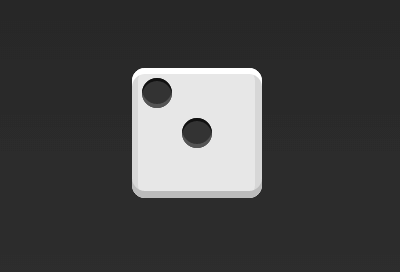
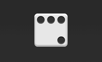
1.3 三项目
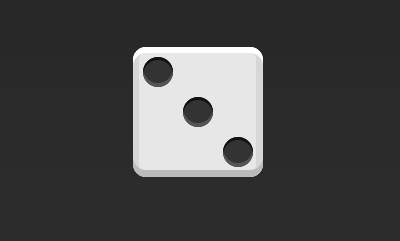
1 2 3 4 5 6 7 8 9 10 11
| .box { display: flex; } .item:nth-child(2) { align-self: center; } .item:nth-child(3) { align-self: flex-end; }
|
1.4 四项目
1 2 3 4 5 6
| .box { display: flex; flex-wrap: wrap; justify-content: flex-end; align-content: space-between; }
|
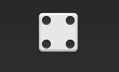
1 2 3 4 5 6 7 8 9 10 11
| <div class="box"> <div class="column"> <span class="item"></span> <span class="item"></span> </div> <div class="column"> <span class="item"></span> <span class="item"></span> </div> </div>
|
1 2 3 4 5 6 7 8 9 10 11
| .box { display: flex; flex-wrap: wrap; align-content: space-between; } .column { flex-basis: 100%; display: flex; justify-content: space-between; }
|
1.5 六项目
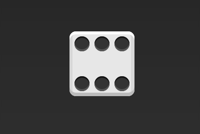
1 2 3 4 5
| .box { display: flex; flex-wrap: wrap; align-content: space-between; }
|
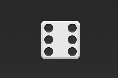
1 2 3 4 5 6
| .box { display: flex; flex-direction: column; flex-wrap: wrap; align-content: space-between; }
|
1 2 3 4 5 6 7 8 9 10 11 12 13 14
| <div class="box"> <div class="row"> <span class="item"></span> <span class="item"></span> <span class="item"></span> </div> <div class="row"> <span class="item"></span> </div> <div class="row"> <span class="item"></span> <span class="item"></span> </div> </div>
|
1 2 3 4 5 6 7 8 9 10 11 12 13 14 15 16 17
| box { display: flex; flex-wrap: wrap; } .row{ flex-basis: 100%; display:flex; } .row:nth-child(2){ justify-content: center; } .row:nth-child(3){ justify-content: space-between; }
|
1.6 九项目
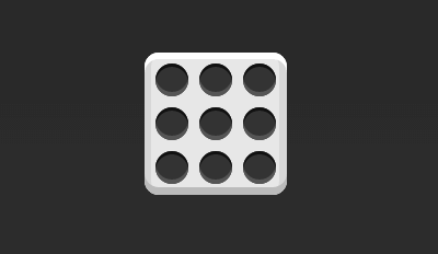
1 2 3 4
| .box { display: flex; flex-wrap: wrap; }
|
二、网格布局
2.1 基本网格布局
- 最简单的网格布局,就是平均分布。在容器里面平均分配空间,跟上面的骰子布局很像,但是需要设置项目的自动缩放
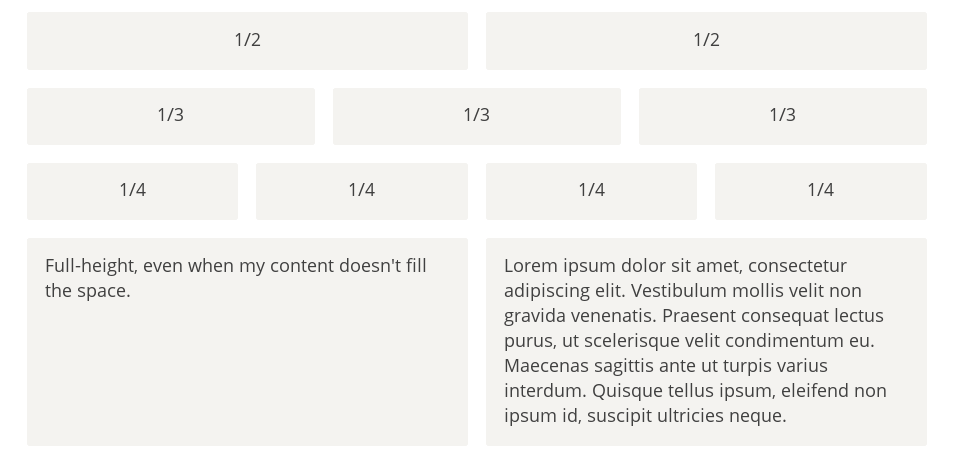
1 2 3 4 5
| <div class="Grid"> <div class="Grid-cell">...</div> <div class="Grid-cell">...</div> <div class="Grid-cell">...</div> </div>
|
1 2 3 4 5 6 7
| .Grid { display: flex; } .Grid-cell { flex: 1; }
|
2.2 百分比布局
- 某个网格的宽度为固定的百分比,其余网格平均分配剩余的空间
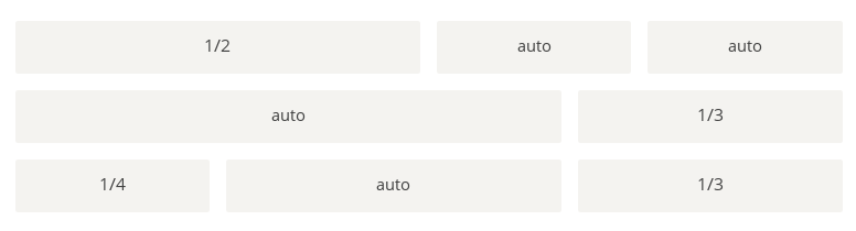
1 2 3 4 5
| <div class="Grid"> <div class="Grid-cell u-1of4">...</div> <div class="Grid-cell">...</div> <div class="Grid-cell u-1of3">...</div> </div>
|
1 2 3 4 5 6 7 8 9 10 11 12 13 14 15 16 17 18 19 20 21 22 23
| .Grid { display: flex; } .Grid-cell { flex: 1; } .Grid-cell.u-full { flex: 0 0 100%; } .Grid-cell.u-1of2 { flex: 0 0 50%; } .Grid-cell.u-1of3 { flex: 0 0 33.3333%; } .Grid-cell.u-1of4 { flex: 0 0 25%; }
|
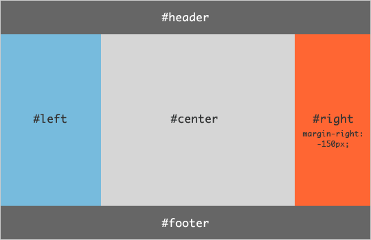
2.3、圣杯布局
- 圣杯布局(Holy Grail Layout)指的是一种最常见的网站布局。页面从上到下,分成三个部分:头部(
header),躯干(body),尾部(footer)。其中躯干又水平分成三栏,从左到右为:导航、主栏、副栏
1 2 3 4 5 6 7 8 9
| <body class="HolyGrail"> <header>...</header> <div class="HolyGrail-body"> <main class="HolyGrail-content">...</main> <nav class="HolyGrail-nav">...</nav> <aside class="HolyGrail-ads">...</aside> </div> <footer>...</footer> </body>
|
1 2 3 4 5 6 7 8 9 10 11 12 13 14 15 16 17 18 19 20 21 22 23 24 25 26 27 28 29
| .HolyGrail { display: flex; min-height: 100vh; flex-direction: column; } header, footer { flex: 1; } .HolyGrail-body { display: flex; flex: 1; } .HolyGrail-content { flex: 1; } .HolyGrail-nav, .HolyGrail-ads { flex: 0 0 12em; } .HolyGrail-nav { order: -1; }
|
1 2 3 4 5 6 7 8 9 10 11
| @media (max-width: 768px) { .HolyGrail-body { flex-direction: column; flex: 1; } .HolyGrail-nav, .HolyGrail-ads, .HolyGrail-content { flex: auto; } }
|
2.4、输入框的布局
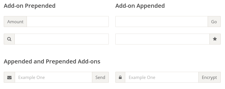
1 2 3 4 5
| <div class="InputAddOn"> <span class="InputAddOn-item">...</span> <input class="InputAddOn-field"> <button class="InputAddOn-item">...</button> </div>
|
1 2 3 4 5 6 7
| .InputAddOn { display: flex; } .InputAddOn-field { flex: 1; }
|
2.5、悬挂式布局
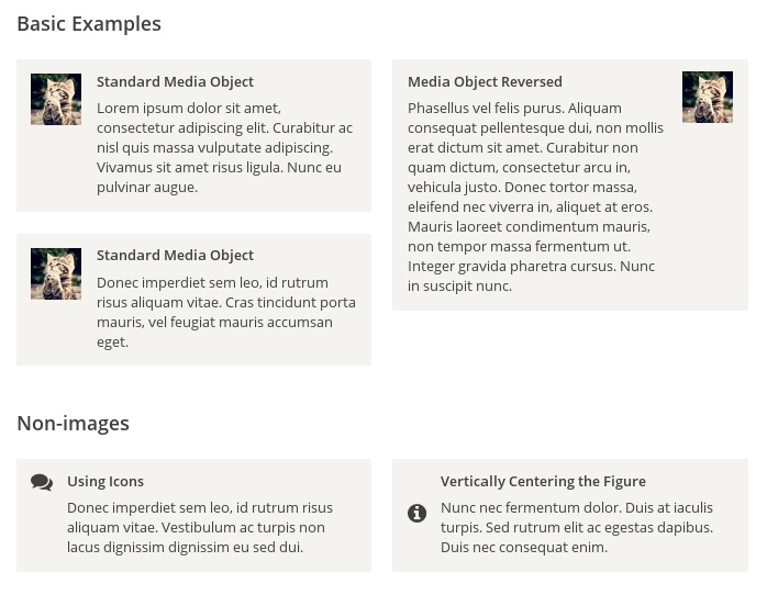
1 2 3 4
| <div class="Media"> <img class="Media-figure" src="" alt=""> <p class="Media-body">...</p> </div>
|
1 2 3 4 5 6 7 8 9 10 11 12
| .Media { display: flex; align-items: flex-start; } .Media-figure { margin-right: 1em; } .Media-body { flex: 1; }
|
2.6、固定的底栏
- 有时,页面内容太少,无法占满一屏的高度,底栏就会抬高到页面的中间。这时可以采用
Flex布局,让底栏总是出现在页面的底部
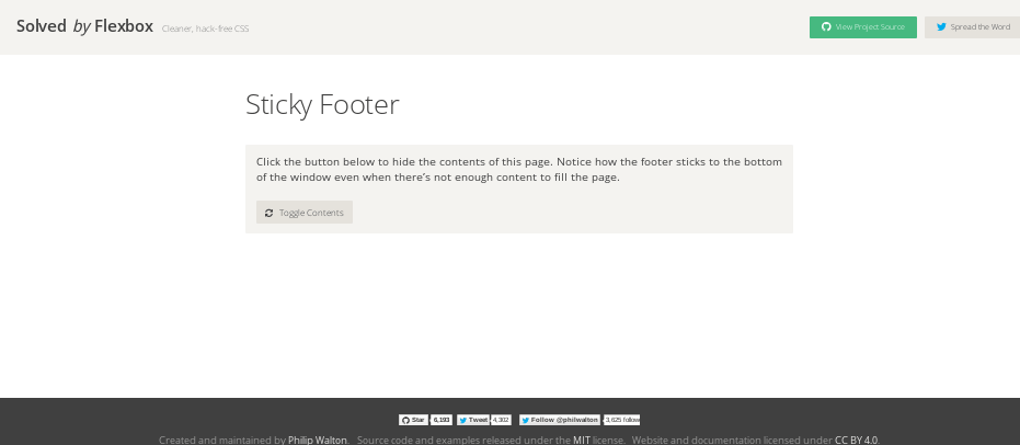
1 2 3 4 5
| <body class="Site"> <header>...</header> <main class="Site-content">...</main> <footer>...</footer> </body>
|
1 2 3 4 5 6 7 8 9
| .Site { display: flex; min-height: 100vh; flex-direction: column; } .Site-content { flex: 1; }
|
2.7,流式布局
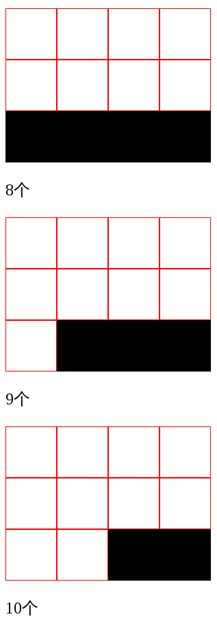
1 2 3 4 5 6 7 8 9 10 11 12 13 14 15 16
| .parent { width: 200px; height: 150px; background-color: black; display: flex; flex-flow: row wrap; align-content: flex-start; } .child { box-sizing: border-box; background-color: white; flex: 0 0 25%; height: 50px; border: 1px solid red; }
|
声明:本文系转载 原文出处
